Project
AHMEDABAD CITY RE-BRANDING & TRANSIT APP
Project Type
Branding/Graphic Design
Objective
Developing a brand from scratch
Design Compeition
Ahmedabad Municipality
Location
Ahmedabad , India
Duration
3 weeks
Team
Arko Roychowdhury
My Role and Project Brief
This course was an elective which I had chosen for my interest in graphic & product design. The design problem was to select a city in India and create graphics which bring out the identity of the city. Consequently, this graphic design exercise was a means to re-brand the city itself. The entire design language/colour palette was derived from the logo. Interestingly, the logo design exercise was a back and forth process to create a logo that doesn't just represent the city but allows its graphic elements to be used as a recipe for merchandise & stationary design.
Research & Design Concept

City of Gates
Ahmedabad is known as the city of gates. Such grand gateways were used to restrict access in the walled city and acted as iconic entrances to welcome visitors. The forms of the arches are at the root of the re-branding exercise.


Research & Design Concepts
The logo form based on arches was placed in a 3x3 grid showcasing 6 cultural features of the city. Additionally, various iterations were tried out by changing the size of the grids, finally the square logo was selected.

The Motera Stadium is one of the main attractions in the city. It's double semi circle shape resembles a roman chariot arena.

For style guides of government documents, the two main fonts selected are Gill Sans and Neuzeit Grot. For signages Johnston ITC is used.

The Neuzeit Grot typeface which is used in most documentations. This was selected as the primary font for the re-design project.
Iconography for Brand


Logo Design
A triple arch motif at the top has been used to portray the Teen Darwaza. Varied weights and colours welcoming the diverse ethnicities of the state.

Style Guides
The design language of the re-design campaign of vibrant colors and soft geometric forms are derived from the Indo-Saranic arch forms. The pink, green and yellow colors will be used to represent the three districts of the city.
Other logo forms of public attractions will be derived from the main city logo. For example, the bowstring arch contour of Ellisbridge.
Logo Iterations


These are other versions of the logo in a dark background.


Patterns for merchandise design and prints for the brand.


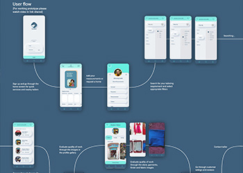
Bus Transit App (UI/UX Design)


App Design
The new city bus transit system was to be co-launched with the re-branding program. The app allows the user to connect their bank accounts to make payments on India's United Payments Interface.
Live bus tracking, dynamic route updates, smooth purchase of tickets or auto-deductions from wallets are the keys features of the app.


Transit Signages
The new bus stop banners were part of the design challenge along with road signage. Colors and fonts for the signages match those on the transit app.

Municipality Web Portal
The function of the web portal for the municipal department was to reach out and engage with the public. It is also a platform to popularize public events. Though legal and tax services of the city government operate seperate portals, they will be accessible through this portal.
Stationary Design